相信大家也有为自己做的hover效果不太满意的,本文给大家介绍几款不错的css鼠标悬浮动画,老规矩,复制粘贴即用。
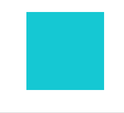
1.Grow-Shadow
效果:
代码:
/* Grow-Shadow */
.hvr-grow-shadow {

  display: inline-block;
  vertical-align: middle;
  -webkit-transform: perspective(1px) translateZ(0);
  transform: perspective(1px) translateZ(0);
  box-shadow: 0 0 1px rgba(0, 0, 0, 0);
  -webkit-transition-duration: 0.3s;
  transition-duration: 0.3s;
  -webkit-transition-property: box-shadow, transform;
  transition-property: box-shadow, transform;
}
.hvr-grow-shadow:hover, .hvr-grow-shadow:focus, .hvr-grow-shadow:active {

  box-shadow: 0 10px 10px -10px rgba(0, 0, 0, 0.5);
  -webkit-transform: scale(1.1);
  transform: scale(1.1);
}
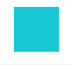
2.Grow
效果:
代码:
/* Grow */
.hvr-grow {

  display: inline-block;
  vertical-align: middle;
  -webkit-transform: perspective(1px) translateZ(0);
  transform: perspective(1px) translateZ(0);
  box-shadow: 0 0 1px rgba(0, 0, 0, 0);
  -webkit-transition-duration: 0.3s;
  transition-duration: 0.3s;
  -webkit-transition-property: transform;
  transition-property: transform;
}
.hvr-grow:hover, .hvr-grow:focus, .hvr-grow:active {

  -webkit-transform: scale(1.1);
  transform: scale(1.1);
}
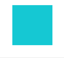
3.Shrink
效果:

代码:
/* Shrink */
.hvr-shrink {

  display: inline-block;
  vertical-align: middle;
  -webkit-transform: perspective(1px) translateZ(0);
  transform: perspective(1px) translateZ(0);
  box-shadow: 0 0 1px rgba(0, 0, 0, 0);
  -webkit-transition-duration: 0.3s;
  transition-duration: 0.3s;
  -webkit-transition-property: transform;
  transition-property: transform;
}
.hvr-shrink:hover, .hvr-shrink:focus, .hvr-shrink:active {

  -webkit-transform: scale(0.9);
  transform: scale(0.9);
}
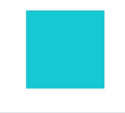
Float
效果:
代码:
/* Float */
.hvr-float {

  display: inline-block;
  vertical-align: middle;
  -webkit-transform: perspective(1px) translateZ(0);
  transform: perspective(1px) translateZ(0);
  box-shadow: 0 0 1px rgba(0, 0, 0, 0);
  -webkit-transition-duration: 0.3s;
  transition-duration: 0.3s;
  -webkit-transition-property: transform;
  transition-property: transform;
  -webkit-transition-timing-function: ease-out;
  transition-timing-function: ease-out;
}
.hvr-float:hover, .hvr-float:focus, .hvr-float:active {

  -webkit-transform: translateY(-8px);
  transform: translateY(-8px);
}
5.Float Shadow
效果:

代码:
/* Float Shadow */
.hvr-float-shadow {

  display: inline-block;
  vertical-align: middle;
  -webkit-transform: perspective(1px) translateZ(0);
  transform: perspective(1px) translateZ(0);
  box-shadow: 0 0 1px rgba(0, 0, 0, 0);
  position: relative;
  -webkit-transition-duration: 0.3s;
  transition-duration: 0.3s;
  -webkit-transition-property: transform;
  transition-property: transform;
}
.hvr-float-shadow:before {

  pointer-events: none;
  position: absolute;
  z-index: -1;
  content: '';
  top: 100%;
  left: 5%;
  height: 10px;
  width: 90%;
  opacity: 0;
  background: -webkit-radial-gradient(center, ellipse, rgba(0, 0, 0, 0.35) 0%, rgba(0, 0, 0, 0) 80%);
  background: radial-gradient(ellipse at center, rgba(0, 0, 0, 0.35) 0%, rgba(0, 0, 0, 0) 80%);
  /* W3C */
  -webkit-transition-duration: 0.3s;
  transition-duration: 0.3s;
  -webkit-transition-property: transform, opacity;
  transition-property: transform, opacity;
}
.hvr-float-shadow:hover, .hvr-float-shadow:focus, .hvr-float-shadow:active {

  -webkit-transform: translateY(-5px);
  transform: translateY(-5px);
  /* move the element up by 5px */
}
.hvr-float-shadow:hover:before, .hvr-float-shadow:focus:before, .hvr-float-shadow:active:before {

  opacity: 1;
  -webkit-transform: translateY(5px);
  transform: translateY(5px);
  /* move the element down by 5px (it will stay in place because it's attached to the element that also moves up 5px) */
}
6.Curl Bottom Right
效果:

代码:
/* Curl Bottom Right */
.hvr-curl-bottom-right {

  display: inline-block;
  vertical-align: middle;
  -webkit-transform: perspective(1px) translateZ(0);
  transform: perspective(1px) translateZ(0);
  box-shadow: 0 0 1px rgba(0, 0, 0, 0);
  position: relative;
}
.hvr-curl-bottom-right:before {

  pointer-events: none;
  position: absolute;
  content: '';
  height: 0;
  width: 0;
  bottom: 0;
  right: 0;
  background: white;
  /* IE9 */
  background: linear-gradient(315deg, white 45%, #aaa 50%, #ccc 56%, white 80%);
  box-shadow: -1px -1px 1px rgba(0, 0, 0, 0.4);
  -webkit-transition-duration: 0.3s;
  transition-duration: 0.3s;
  -webkit-transition-property: width, height;
  transition-property: width, height;
}
.hvr-curl-bottom-right:hover:before, .hvr-curl-bottom-right:focus:before, .hvr-curl-bottom-right:active:before {

  width: 25px;
  height: 25px;
}
7.Bubble Float Right
效果:

代码:
/* Bubble Float Right */
.hvr-bubble-float-right {

  display: inline-block;
  vertical-align: middle;
  -webkit-transform: perspective(1px) translateZ(0);
  transform: perspective(1px) translateZ(0);
  box-shadow: 0 0 1px rgba(0, 0, 0, 0);
  position: relative;
  -webkit-transition-duration: 0.3s;
  transition-duration: 0.3s;
  -webkit-transition-property: transform;
  transition-property: transform;
}
.hvr-bubble-float-right:before {

  position: absolute;
  z-index: -1;
  top: calc(50% - 10px);
  right: 0;
  content: '';
  border-style: solid;
  border-width: 10px 0 10px 10px;
  border-color: transparent transparent transparent #e1e1e1;
  -webkit-transition-duration: 0.3s;
  transition-duration: 0.3s;
  -webkit-transition-property: transform;
  transition-property: transform;
}
.hvr-bubble-float-right:hover, .hvr-bubble-float-right:focus, .hvr-bubble-float-right:active {

  -webkit-transform: translateX(-10px);
  transform: translateX(-10px);
}
.hvr-bubble-float-right:hover:before, .hvr-bubble-float-right:focus:before, .hvr-bubble-float-right:active:before {

  -webkit-transform: translateX(10px);
  transform: translateX(10px);
}
8.Box Shadow Inset
效果:
代码:
/* Box Shadow Inset */
.hvr-box-shadow-inset {

  display: inline-block;
  vertical-align: middle;
  -webkit-transform: perspective(1px) translateZ(0);
  transform: perspective(1px) translateZ(0);
  box-shadow: 0 0 1px rgba(0, 0, 0, 0);
  -webkit-transition-duration: 0.3s;
  transition-duration: 0.3s;
  -webkit-transition-property: box-shadow;
  transition-property: box-shadow;
  box-shadow: inset 0 0 0 rgba(0, 0, 0, 0.6), 0 0 1px rgba(0, 0, 0, 0);
  /* Hack to improve aliasing on mobile/tablet devices */
}
.hvr-box-shadow-inset:hover, .hvr-box-shadow-inset:focus, .hvr-box-shadow-inset:active {

  box-shadow: inset 2px 2px 2px rgba(0, 0, 0, 0.6), 0 0 1px rgba(0, 0, 0, 0);
  /* Hack to improve aliasing on mobile/tablet devices */
}
 菜鸟笔记
菜鸟笔记