 菜鸟笔记
菜鸟笔记简介:
display:flex是一种布局方式。它即可以应用于容器中,也可以应用于行内元素。是W3C提出的一种新的方案,可以简便、完整、响应式地实现各种页面布局。目前,它已经得到了所有浏览器的支持。
Flex是FlexibleBox的缩写,意为”弹性布局”,用来为盒状模型提供最大的灵活性。设为Flex布局以后,子元素的float、clear和vertical-align属性将失效。
- display flex容器的属性
- flex-direction
- flex-wrap
- justify-content
- align-items
- align-content
实例:
接下来我们用下面的代码进行对上面的属性进行逐一具体的演示
<!DOCTYPE html>
<html>
<head>
<meta charset="utf-8" />
<title></title>
<style>
/* 在css中设置 row */
.content{
width : 500px;
height : 300px;
background-color : brown;
}
.content-item{
width : 50px;
height: 50px;
}
.item1{
background-color: black;
}
.item2{
background-color: blue;
}
.item3{
background-color: red;
}
</style>
</head>
<body>
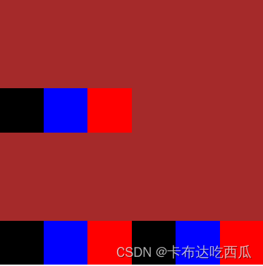
<div class="content">
<div class="content-item item1"></div>
<div class="content-item item2"></div>
<div class="content-item item3"></div>
</div>
</body>
</html>
其样式如此
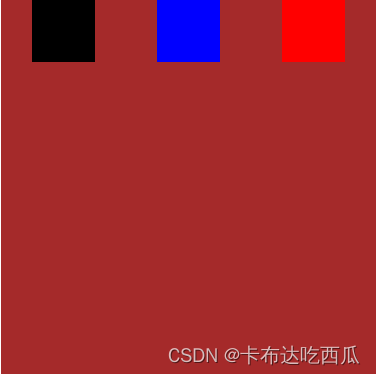
flex-direction属性决定主轴的方向(即项目的排列方向),其有一下几个属性:
- row(默认值):主轴为水平方向,起点在左端。
- row-reverse:主轴为水平方向,起点在右端。
- column:主轴为垂直方向,起点在上沿。
- column-reverse:主轴为垂直方向,起点在下沿。
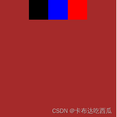
	/* 我们在父div中设置加入两行代码 */
	/* flex-direction:row; */
	.content{

		width  : 500px;
		height : 300px;
		background-color : brown;

		/* 新加的代码 */
		display : flex;
		flex-direction:row;
	}
其样式如此

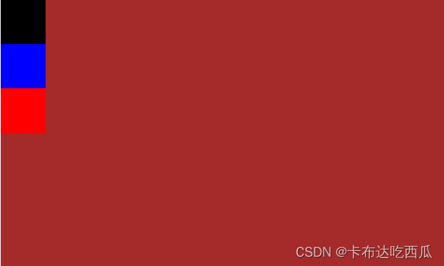
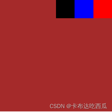
	/* flex-direction: row-reverse; */
	.content{

		width  : 500px;
		height : 300px;
		background-color : brown;

		/* 新加的代码 */
		display : flex;
		flex-direction: row-reverse;
	}
其样式如此

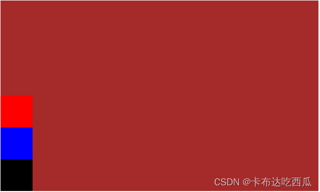
	/* flex-direction: column; */
	.content{

		width  : 500px;
		height : 300px;
		background-color : brown;

		/* 新加的代码 */
		display : flex;
		flex-direction: column;
	}
其样式如此

	/* flex-direction: column-reverse; */
	.content{

		width  : 500px;
		height : 300px;
		background-color : brown;

		/* 新加的代码 */
		display : flex;
		flex-direction: column-reverse;
	}
其样式如此
flex-wrap属性决定了如果一条轴线排不下,如何换行。
- nowrap(默认):不换行。
- wrap:换行,第一行在上方。
- wrap-reverse:换行,第一行在下方。
	/*设置默认不换行*/
	/*flex-wrap:nowrap;*/
	.content{

		width  : 300px;
		height : 300px;
		background-color : brown;

		/* 新加的代码 */
		display : flex;
		flex-direction: row;
		flex-wrap:nowrap;
	}
其样式如此
我们可以明显看到,每一个子div都被压缩到了一行。
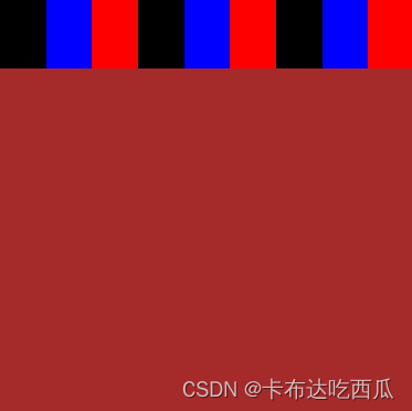
	/*设置换行*/
	/*flex-wrap:wrap;*/
	.content{

		width  : 300px;
		height : 300px;
		background-color : brown;

		/* 新加的代码 */
		display : flex;
		flex-direction: row;
		flex-wrap:wrap;
	}
其样式如此
我们可以明显看到了分行。之所以没有出现两行紧紧挨在一起,是因为我们没有设置子div在列上如何排布,我们会在后面的align-content属性介绍。
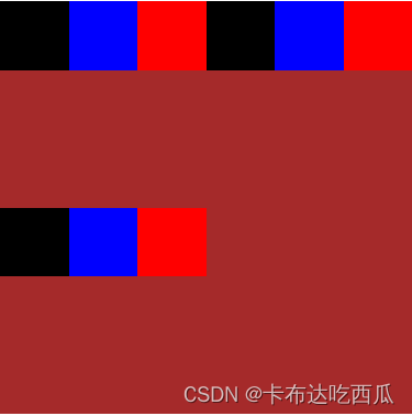
	/*flex-wrap:wrap-reverse;*/
	.content{

		width  : 300px;
		height : 300px;
		background-color : brown;

		/* 新加的代码 */
		display : flex;
		flex-direction: row;
		flex-wrap:wrap-reverse;
	}
其样式如此
justify-content属性定义了项目在主轴上的对齐方式。其有一下几个属性:
- flex-start(默认值):左对齐
- flex-end:右对齐
- center: 居中
- space-between:两端对齐,项目之间的间隔都相等。
- space-around:每个项目两侧的间隔相等。
	/* 左对齐*/
	/* justify-content:flex-start;*/
	.content{

		width  : 300px;
		height : 300px;
		background-color : brown;

		/* 新加的代码 */
		display : flex;
		flex-direction: row;
		flex-wrap:wrap;
		justify-content:flex-start;
	}
其样式如此

	/* 右对齐*/
	/* justify-content:flex-end;*/
	.content{

		width  : 300px;
		height : 300px;
		background-color : brown;

		/* 新加的代码 */
		display : flex;
		flex-direction: row;
		flex-wrap:wrap;
		justify-content:flex-end;
	}
其样式如此
	/* 居中*/
	/* justify-content:center;*/
	.content{

		width  : 300px;
		height : 300px;
		background-color : brown;

		/* 新加的代码 */
		display : flex;
		flex-direction: row;
		flex-wrap:wrap;
		justify-content:center;
	}
其样式如此
	/* 两端对齐*/
	/* justify-content:space-between;*/
	.content{

		width  : 300px;
		height : 300px;
		background-color : brown;

		/* 新加的代码 */
		display : flex;
		flex-direction: row;
		flex-wrap:wrap;
		justify-content:space-between;
	}
其样式如此

	/* 间隔相等*/
	/* justify-content:space-around;*/
	.content{

		width  : 300px;
		height : 300px;
		background-color : brown;

		/* 新加的代码 */
		display : flex;
		flex-direction: row;
		flex-wrap:wrap;
		justify-content:space-around;
	}
其样式如此
align-items属性定义项目在交叉轴上如何对齐。简单来讲,加入我们将flex-direction设置为row,即主轴为行。align-items可以决定元素在列上的布局。其有一下几个属性:
- flex-start:交叉轴的起点对齐,一行根据上边对齐。
- flex-end:交叉轴的终点对齐,一行根据下边对齐。
- center:交叉轴的中点对齐。
- baseline: 项目的第一行文字的基线对齐。
- stretch(默认值):如果项目未设置高度或设为auto,将占满整个容器的高度。
align-content属性定义了多根轴线的对齐方式。如果项目只有一根轴线,该属性不起作用。简单来讲,加入我们将flex-direction设置为row,即主轴为行。align-content决定了出现很多行时,这些行之间怎么对齐。其有一下几个属性:
- flex-start:与交叉轴的起点对齐,跟作文一样,一行一行紧挨着。
- flex-end:与交叉轴的终点对齐,跟 flex-start类型,不过时从底部开始数。
- center:与交叉轴的中点对齐,从中间向下向上扩散。
- space-between:与交叉轴两端对齐,轴线之间的间隔平均分布。
- space-around:每根轴线两侧的间隔都相等。
- stretch(默认值):轴线占满整个交叉轴。